The wave
Filter By
- All
- Advertising
- Design
- Projects
- Social Media
- Web
SAFE IN HARM’S WAY
THE CHALLENGE
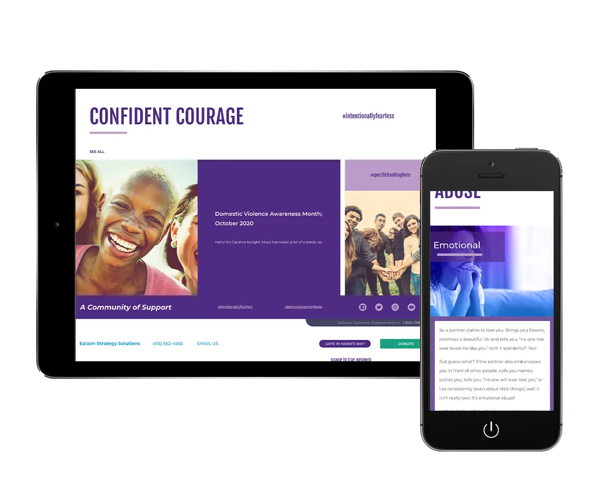
Safe In Harm’s Way had a self-built website with plenty of content, however branding was inconsistent and there was no vector based logo. Epizon needed to be built out from the ground up, as there was no site or logo.
THE STRATEGY
Create sister websites that provided the separation needed between the business and nonprofit entities, as well as create new logos that still tied the brands together through design.
THE DESIGN
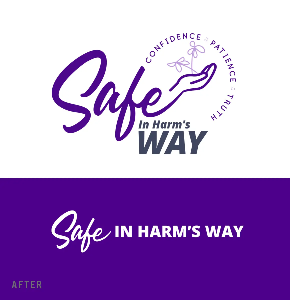
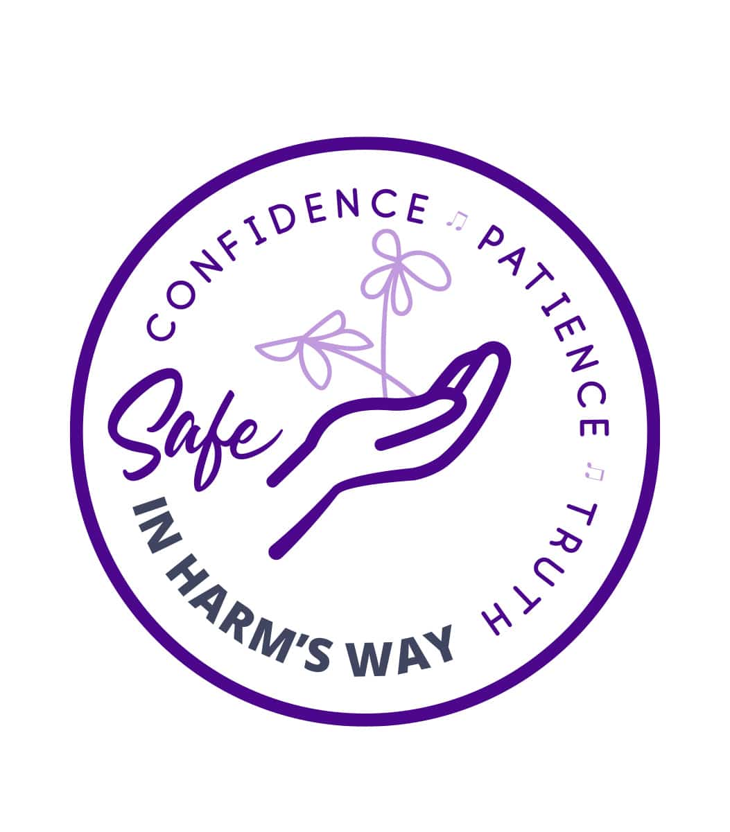
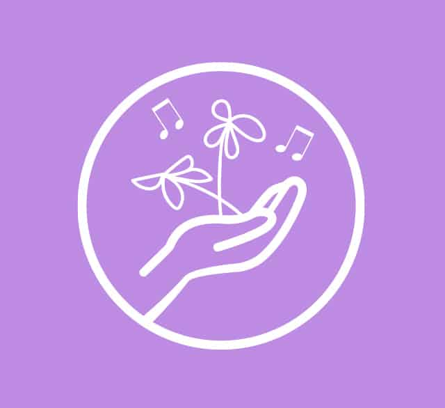
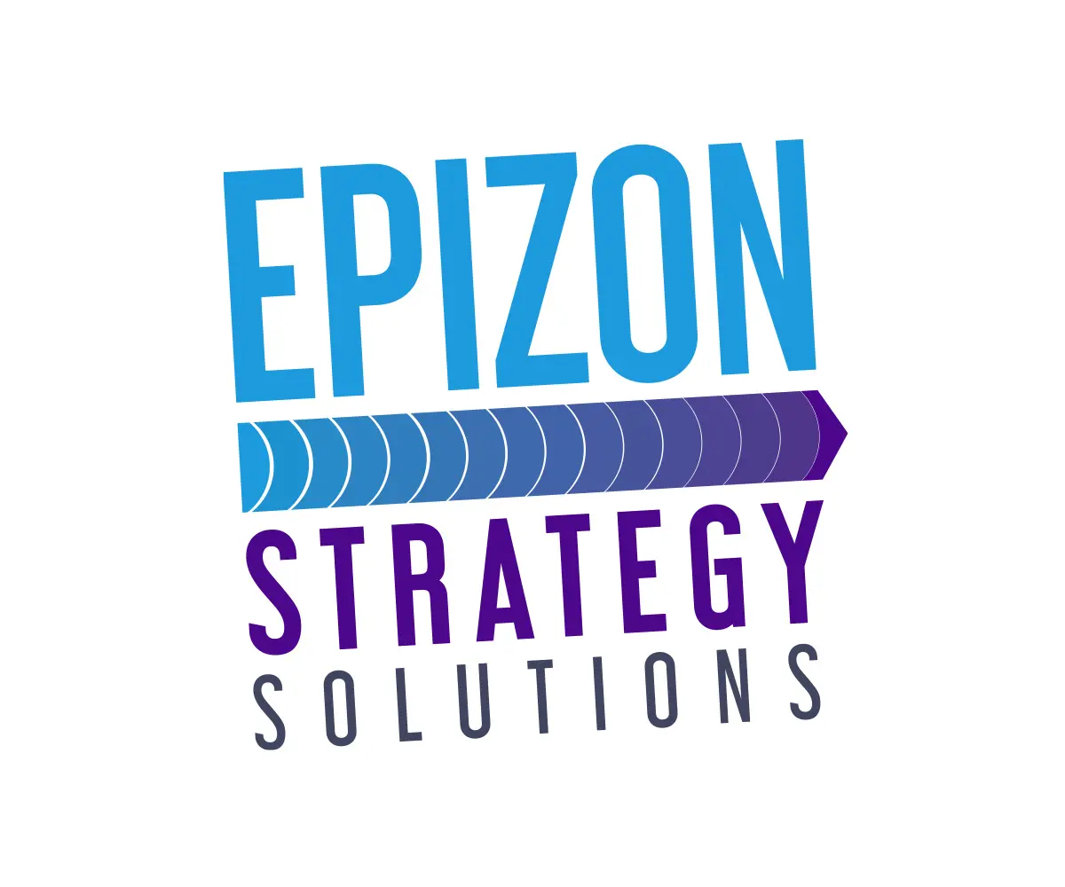
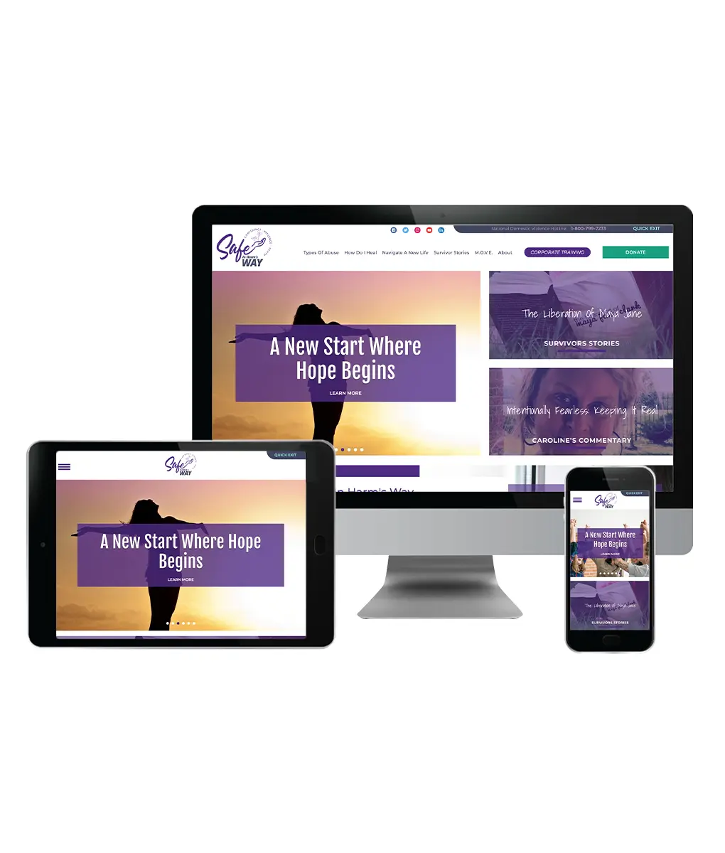
Both logos utilize purple as the primary color for use in domestic violence support. For Safe In Harm’s Way, the client wanted to incorporate the flowers from the previous logo. A hand emerging from the “e” gave us the opportunity to use them as a focal point that gives the overall logo a sense of caring and empathy. Mixed fonts and weights give the logo a feminine feel that also showcases a victim’s strength. A balanced tagline uses music notes as bullets, representing the importance of music in the healing and recovery process. The Epizon logo introduces a secondary color to help create an upbeat logo emitting positive energy. This logo was born out of other concepts the client liked from creating the Safe In Harm’s Way design.
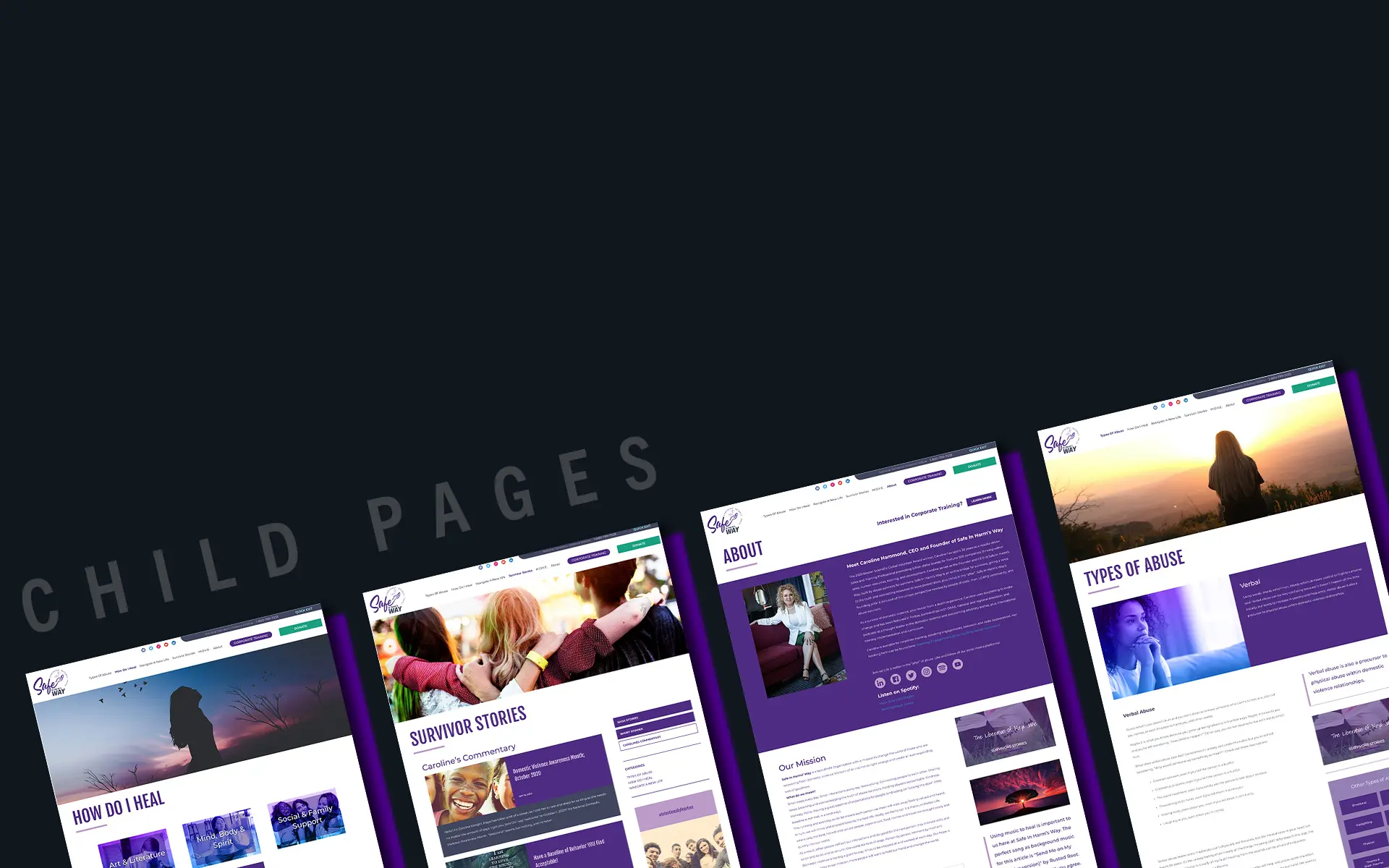
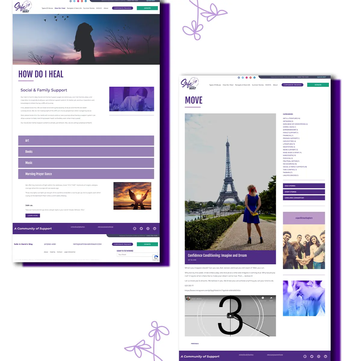
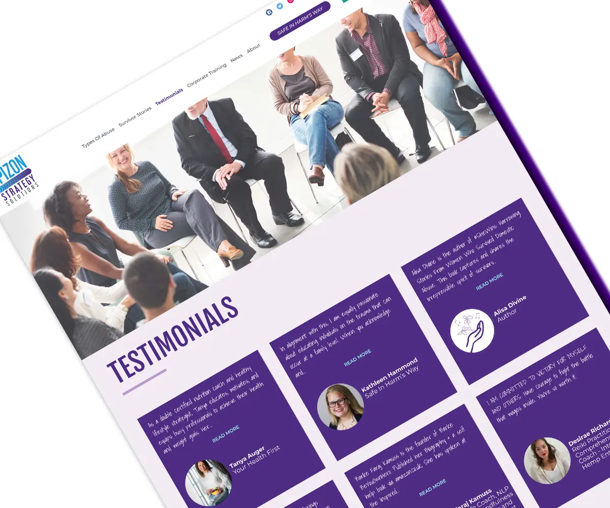
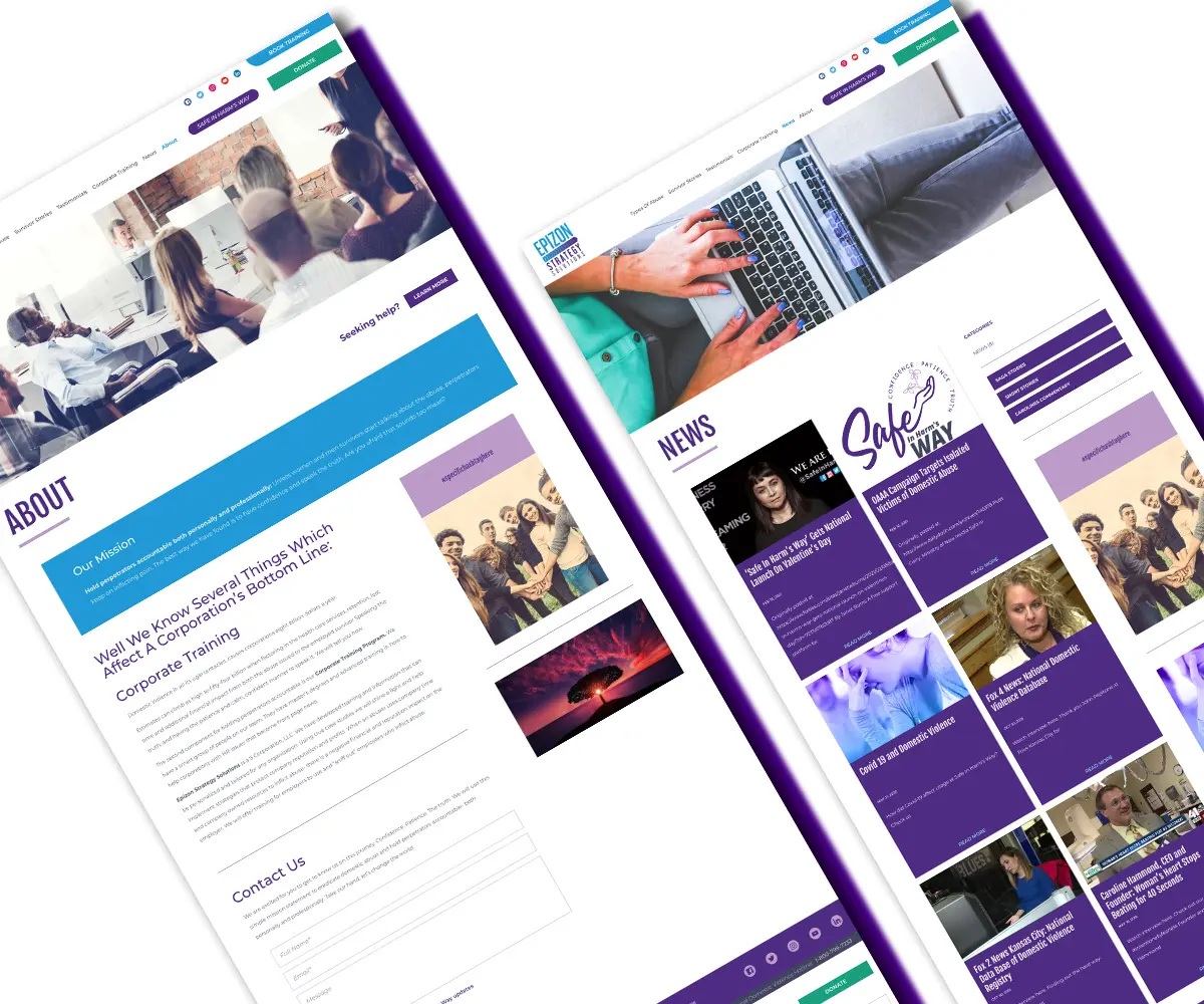
The initial focus for the websites was organizing the sitemaps and content to help streamline the focus for both sites. A balanced hierarchy needed to be clearly defined to help visitors confidently navigate content and resources. Modern and confidence were key feelings both websites needed to invoke. Easy-to-use navigation and balanced content helps tie the two sites together. Images that deal with difficult subjects have a gradient, while images highlighting positivity are purposely bright and full of energy. For Safe In Harm’s Way, a crucial feature needed to be added to help keep victims safe while visiting the site. A “Quick Exit” button follows the user throughout their session—when clicked, it will quickly close the website and clear it from the browser’s history. Both websites were also designed for easy editing on the backend by connecting them through a single CMS.
THE OUTCOME
Caroline Hammond now has two websites with separate focuses that are easy to use on both the front- and backends, as well as two new brand identities that completely represent what she stands for.